For those new to CabbieBlog or readers who are slightly forgetful, on Saturdays I’m republishing posts, many going back over a decade. Some will still be very relevant while others have become dated over time. Just think of this post as your weekend paper supplement.
Order out of chaos (17.09.2010)
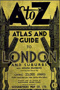
On CabbieBlog there are currently 180 posts and by far the most read has been a short introduction to London’s maps, so you might say that today’s contribution is back by popular demand.
In any city as large and diverse as London is maps can help you find your way around, and probably the most famous of these is Harry Beck’s tube map, although another use of mapping is perhaps less obvious, but these are often of far more use. These are maps that can be used when order has broken down to show the causality and how that order might be returned.
Morgan Map 1682
On Sunday 2 September 1660, the Great Fire of London began reducing most of the City to ashes, and among the huge losses were many maps of the city itself. The Morgan Map of 1682 was the first to show the whole of the City of London after the fire. Consisting of sixteen separate sheets, each measuring eight feet by five feet, it took six years to complete. The map is based on the first detailed and truly scientific surveys of the City, Westminster and Southwark, which had been underway since immediately after the Great Fire in 1666. For the first time the layout of buildings was shown vertically, and on the basis of mathematical calculation rather than pictorially, as had previously been popular. William Morgan’s beautiful map, on a scale of 300 feet to the inch, completed in 1682, symbolised the hoped-for ideal city.
Snow Map 1854
In the nineteenth century, there were several outbreaks of cholera in London. One could awake hale and hearty, develop diarrhoea, vomiting, agonising cramps and by teatime succumb to delirium and death. In the 1849 outbreak, a large proportion of the victims received their water from two water companies, both of these water companies had as the source of their water the river Thames just downstream from a sewer outlet. Dr. John Snow plotted the distribution of deaths in London on a map. He determined that an unusually high number of deaths were taking place near a water pump on Broad Street. Snow’s findings led him to petition the local authorities to remove the pump’s handle. This was done and the number of cholera deaths was dramatically reduced. The work of John Snow stands out as one of the most famous and earliest cases of geography and maps being utilized to understand the spread of a disease. Today, specially trained medical geographers and medical practitioners routinely use mapping and advanced technology to understand the diffusion and spread of diseases such as AIDS and cancer. A map is not just an effective tool for finding the right place; it can also be a life saver.
Abercrombie Map 1945
The Blitz of September 1940 had a shattering impact on London and its inhabitants. On just the first night of the attacks, 7th September, over 400 civilians lost their lives and 1,600 people were severely injured. Out of this destruction emerged the idea of reconstruction. Straight away innumerable newspaper articles, pamphlets, books, exhibitions and films called for the British Government to begin to prepare for when the conflict would be over. Whilst British forces were fighting throughout Europe, Africa and other parts of the world, exhibitions such as Rebuilding Britain in July 1943 began to set out a new agenda for architects and those concerned with the built environment. At the time, Patrick Abercrombie was one of the most authoritative figures on modern town planning. The best-known study that Abercrombie and his team of researchers completed was for London and after two years of research, he published The County of London Plan in 1943. Significantly, it recommended the establishment of several new towns on the outskirts of London, relieving congestion in the city’s central areas and to stop suburban sprawl. Its bright red indicates the areas of London that contained industry at this point in 1943, as you can see, there is a significant amount of red concentrated around the Thames just east of the Isle of Dogs – before the war there was still much heavy industry concentrated around the East End. The map was regarded as key to the argument for reconstruction.