Tag Archives: london maps

London’s oldest map

Not long ago there was a craze for colouring books, not the one for young children, but for adults. Many of those books now seem to have left the shelves of bookshops, I suppose Covid lockdown saw to that, there must be just so many swirls you can colour in.

Recently, taking this idea to a whole new level has been a project undertaken by Matt Brown of the Londonist. He took the first known map of London from the 16th century, printed in black by the copperplate method and brought it to life. It is thought that originally the map consisted of 15 panels of which only three are known, nevertheless, the coloured detail represented here gives us some understanding of Tudor London.

From what was a pretty prosaic representation of the city, seen on many maps around that time, Matt has brought it into stunning focus, you can see how London looked before the Great Fire of London, and surprisingly how much of the original road network survived post the fire.

Featured image: Matt’s colouring of Moorfield, he has gone on to write about the project with far more images on London: Time Machine available on Substack.

A Map for Every City

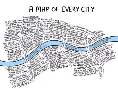
After Tuesday’s post about 1930s London maps, I thought a contemporary definition could be looked at. Seven years ago Chaz Hutton doodled a map on a post-it note, he then posted it on Twitter [featured image] and 48 hours later it had 3,000 re-tweets.

He described it as:

A map of people’s experience of living in cities: The changing circumstances of people as they get older and have children, the way ‘cool’ areas emerge from formerly ‘rough’ areas and are then invariably compared to the less-cool, traditionally wealthy areas, the kind of areas that an Ikea needs to be built for it to be profitable. All these things are endemic to most large cities, with most of them the outcomes of events situated at some point along the gentrification arc.

Since that map appeared there’s been a lot of speculation as to which city he drew. Chaz claims that it is a generic representation, and as many cities have a river running through them, he could be right. Curiously everyone managed to find their own cities within the same map.

Although the original conception of the idea for the style of the map did originally stem from a map of London, and the river has the same proportions, the diagram could apply to most cities.

Below is the refined version, I’ll leave it to you to decide what city it represents.

4-Way Split

Today mapper extraordinaire Alasdair Rae is featured, who decided to make a map that would “split the population of the UK into four roughly equal parts using a big grid and then designate capital cities that nobody would have a problem with”.

Interestingly London, and the reason for this post, has been split. Not in the traditional cabbies’ Sarf of the River and Yes! I’m going Norf Squire. Alastair Rae’s map splits the capital in a north-west:south-east divide. This must show that West London has a less dense populace.

Alistair Rae @undertheraedar