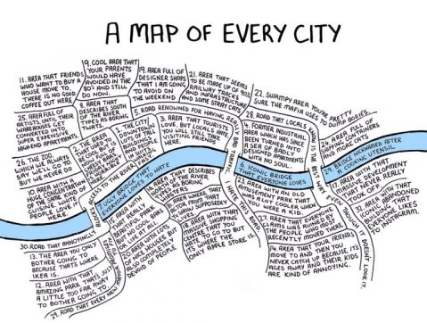
After Tuesday’s post about 1930s London maps, I thought a contemporary definition could be looked at. Seven years ago Chaz Hutton doodled a map on a post-it note, he then posted it on Twitter [featured image] and 48 hours later it had 3,000 re-tweets.
He described it as:

A map of people’s experience of living in cities: The changing circumstances of people as they get older and have children, the way ‘cool’ areas emerge from formerly ‘rough’ areas and are then invariably compared to the less-cool, traditionally wealthy areas, the kind of areas that an Ikea needs to be built for it to be profitable. All these things are endemic to most large cities, with most of them the outcomes of events situated at some point along the gentrification arc.

Since that map appeared there’s been a lot of speculation as to which city he drew. Chaz claims that it is a generic representation, and as many cities have a river running through them, he could be right. Curiously everyone managed to find their own cities within the same map.
Although the original conception of the idea for the style of the map did originally stem from a map of London, and the river has the same proportions, the diagram could apply to most cities.
Below is the refined version, I’ll leave it to you to decide what city it represents.