
Monthly Archives: July 2023

London in Quotations: William Fitzstephen

The two only inconveniences of London are the excessive drinking of some foolish people, and the frequent fires.

William Fitzstephen (d.1191)
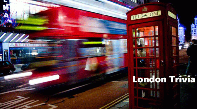
London Trivia: Morning Ma’am
On 9 July 1982 Michael Fagan broke into Buckingham Palace and spent 10 minutes talking to the Queen in her bedroom. He scaled the walls around the palace and shinned a drain-pipe up to the Queen’s private apartments. Barefooted and wearing a t-shirt the unemployed father of four evaded electronic alarms before disturbing the Queen by opening a curtain. It was the first time that private royal apartments had been penetrated since Queen Victoria’s reign.
 On 9 July 1991 a bank collapsed costing taxpayers millions, the closure of the Bank of Credit and Commerce International lost about 20 local councils up to £30 million in investments
 On 9 July 1864 England’s 1st railway murder, 70 year old bank clerk Thomas Briggs body was found on the tracks near Hackney Wick
 The Hanger Lane Gyratory System known as Malfunction Junction is so complicated was voted Britain’s scariest junction by anxious motorists
 Karl Marx one of the many famous residents at Highgate Cemetery, his tomb has been bombed twice, in 1965 and 1970
 St Mary Woolnoth’s past rector was reformed former slave-trader John Newton friend of William Wilberforce and author of hymn Amazing Grace
 Founded in 1811 and designed by Sir John Soane, the Dulwich Picture Gallery is the oldest purpose-built gallery in Britain
 Belsize House became a byword for scandal in the 1720s notorious for immoral parties, extravagant feasts, mud-wrestling and illegal gambling
 On 9 July 1877 the first Wimbledon Championships began with a single event-The Gentlemen’s Singles Tournament, won by Spencer Gore, aged 27 against 22 competitors each paying a guinea to enter
![]() Greenford station remains the only one on the Underground with wooden escalators all others were removed after large fire at King’s Cross
Greenford station remains the only one on the Underground with wooden escalators all others were removed after large fire at King’s Cross
 Jacob Cohen opened his first Tesco in Burnt Oak combining the initials of his tea supplier T.E. Stockwell with his surname’s first letters
 In a bizarre episode Gunnersbury Station was badly damaged in 1954 when a tornado ripped off its roof injuring six people
![]() Trivial Matter: London in 140 characters is taken from the daily Twitter feed @cabbieblog.
Trivial Matter: London in 140 characters is taken from the daily Twitter feed @cabbieblog.
A guide to the symbols used here and source material can be found on the Trivial Matter page.

Previously Posted: The Right Type
For those new to CabbieBlog or readers who are slightly forgetful, on Saturdays I’m republishing posts, many going back over a decade. Some will still be very relevant while others have become dated over time. Just think of this post as your weekend paper supplement.
The Right Type (06.07.2010)
You probably haven’t heard his name before and after reading this will probably never again, but Edward Johnson has given us a symbol for London every bit as iconic as a red bus or my black taxi, and we hardly ever notice it.
A font designed nearly a century ago was adopted as the Underground’s corporate typeface and almost subliminally its usage has given an identity to London Transport and is now used for all of Transport for London’s media. With its distinctive sans-serif font for years known as “Underground” it has capitals based on roman square capitals and a lower case said to be taken from 15th century Italian handwriting. A perfectly round “O” the unusual use of a diamond dot above the “i” and “j” and with a capital M its diagonal stroke meeting at its centre, its design quite simply would change the way we read today.
By 1913 Johnston was a man already making a name for himself in the world of type. Then 35, Johnston had only really discovered his talent for (and love of) typography in his mid-twenties. By 1906, however, he had already been recognised as a man who had almost single-handedly revived and rediscovered the art of calligraphical type and lettering, and was the much-loved teacher of many of print’s future greats, his book, Writing & Illuminating & Lettering would be (and indeed still is, I should know, having once been a typesetter) one of the “must read” texts for anyone in the typographical world.
His brief was that the typeface should have “the bold simplicity of the authentic lettering of the finest periods”, it should also be easy to read from a moving train and in bad lighting, be noticeably up-to-date with the times, and yet also be completely different from anything found on other shops and signage” and finally, Johnston was told that each letter should be “a strong and unmistakeable symbol.” It took him three years (in fact all likelihood it probably didn’t – Johnston was notorious for leaving commissions until the very last minute), but in 1915 Johnston delivered a character-set that met every single one of those demands.
What Johnston created was, in effect, the very first modern “Sans-Serif” typeface which are “fonts without the little kicks.” Open up a word processing program and print out this article (CabbieBlog is set in 10pt Trebuchet MS if you’re interested), first in Times New Roman, then print it out in Arial (or Helvetica if you’re on a Mac) and look at the difference – you’ll see that the letters in the “Times” version are slightly more ornate around the edges. This is because Times is a “Serif” font and Arial is Sans-Serif. In the simplest, most generic terms, this is the difference between the two families.
Sans-Serif typefaces, therefore, are those “flourishless” families like Verdana, Arial, Helvetica and the ubiquitous Comic Sans, faces that bless documents everywhere and virtually the entire internet. Sans-Serif faces are, in many ways, the living embodiment of text in the 20th Century and Johnston, with the typeface that he delivered, almost singlehandedly revived them as a valid and useful style. The typeface now renamed as Johnson Sans, has been subtly updated by Eiichi Kono in the late seventies.
The London Transport Roundel again designed by Johnson who took an existing design of the YMCA logo and turned the basic bulls-eye into the clear and strikingly handsome symbol we see today, and like his typeface was tweaked over many years by Johnson, a process which continues today even now.
The London Transport signs are made of vitreous enamel requiring a process of silk-screen printing and five separate firings in a furnace. Incredibly all are made by a third generation family A. J. Wells & Sons of Newport, Isle of Wight.

Test Your Knowledge: July 2023
This year marks the 900th Anniversary of Barts Hospital, how well do you know this world-class medical institution? As before the correct answer will turn green when it’s clicked upon and expanded to give more information. The incorrect answers will turn red giving the correct explanation.
1. Founded in 1123 by a monk called Rahere, what other job did Rahere perform?
Master of the Stools to Henry I
WRONG Depicted in a stained-glass window in St Bartholomew the Less Church shows Rahere in monk’s robes but with the multicoloured leggings of a jester.
Jester and Courtier to Henry I
CORRECT Depicted in a stained-glass window in St Bartholomew the Less Church shows Rahere in monk’s robes but with the multicoloured leggings of a jester.
Keeper of the Keys
WRONG Depicted in a stained-glass window in St Bartholomew the Less Church shows Rahere in monk’s robes but with the multicoloured leggings of a jester.
2. In A Study in Scarlet Sherlock Holmes first meets Dr John Watson at Bart’s Hospital, as recorded on a plaque in the hospital’s museum, what are Holmes’s first words to his future housemate?
Dr Watson, I presume
WRONG Upon their first fictional encounter on 1st January 1881, Holmes is using the hospital laboratory for experiments with blood stains when Watson, who had served in the Afghan theatre of war and was wounded at the Battle of Maiwand, is shown in by a mutual acquaintance called Stamford. Both looking for accommodation, the famous duo agree to take rooms in Baker Street.
You have been in Afghanistan, I perceive
CORRECT Upon their first fictional encounter on 1st January 1881, Holmes is using the hospital laboratory for experiments with blood stains when Watson, who had served in the Afghan theatre of war and was wounded at the Battle of Maiwand, is shown in by a mutual acquaintance called Stamford. Both looking for accommodation, the famous duo agree to take rooms in Baker Street.
Do you know the way to Amarillo?
WRONG Upon their first fictional encounter on 1st January 1881, Holmes is using the hospital laboratory for experiments with blood stains when Watson, who had served in the Afghan theatre of war and was wounded at the Battle of Maiwand, is shown in by a mutual acquaintance called Stamford. Both looking for accommodation, the famous duo agree to take rooms in Baker Street.
3. Which artist painted the vast canvases that decorate the stairs of the hospital’s great hall?
William Hogarth
CORRECT William Hogarth who was born just yards away from Barts in Bartholomew Close is said to have taken the commission for no pay, rather than let it go to Italian artists.
William Kent
WRONG William Hogarth who was born just yards away from Barts in Bartholomew Close is said to have taken the commission for no pay, rather than let it go to Italian artists.
William Blake
WRONG William Hogarth who was born just yards away from Barts in Bartholomew Close is said to have taken the commission for no pay, rather than let it go to Italian artists.
4. Named after St Bartholomew, one of the Twelve Apostles, how was it said that Bartholomew was martyred?
Flayed
CORRECT The apostle is said to have been martyred by flaying and beheading at the command of the Armenian king Astyages. His relics were supposedly taken to the Church of St. Bartholomew-in-the-Tiber.
Crucified
WRONG The apostle is said to have been martyred by flaying and beheading at the command of the Armenian king Astyages. His relics were supposedly taken to the Church of St. Bartholomew-in-the-Tiber.
Garotted
WRONG The apostle is said to have been martyred by flaying and beheading at the command of the Armenian king Astyages. His relics were supposedly taken to the Church of St. Bartholomew-in-the-Tiber.
5. Whose statue stands above the gatehouse of Bart’s, said to be the only one in London to depict this person?
Henry VIII
CORRECT A favourite with Knowledge examiners, this rather tiny statue commemorates Henry VIII saving the hospital. Another steel structure of Henry stands in Central Park, Havering. We locals insist that the London Borough of Havering is in Essex, unfortunately, Sadiq disagrees.
Henry Mayhew
WRONG A favourite with Knowledge examiners, this rather tiny statue commemorates Henry VIII saving the hospital. Another steel structure of Henry stands in Central Park, Havering. We locals insist that the London Borough of Havering is in Essex, unfortunately, Sadiq disagrees.
Henry Cooper
WRONG A favourite with Knowledge examiners, this rather tiny statue commemorates Henry VIII saving the hospital. Another steel structure of Henry stands in Central Park, Havering. We locals insist that the London Borough of Havering is in Essex, unfortunately, Sadiq disagrees.
6. In 1954 Barts became the first hospital in the country to offer which ground-breaking treatment for cancer?
Chemotherapy
WRONG Megavoltage radiotherapy (MRT) is now commonly used to deliver doses of radiation to patients with cancer.
Radiotherapy
CORRECT Megavoltage radiotherapy (MRT) is now commonly used to deliver doses of radiation to patients with cancer.
Hyperthermia
WRONG Megavoltage radiotherapy (MRT) is now commonly used to deliver doses of radiation to patients with cancer.
7. The grand staircase leading up to the Great Hall is home to two murals The Pool of Bethesda (1736) and The Good Samaritan (1737). Why is one a lesser quality?
The artist ran out of paint
WRONG Due to William Hogarth’s fear of heights, the more intricate of the two murals, The Pool of Bethesda, was painted in a different location, whilst The Good Samaritan was painted in situ but with far less detail.
The artist was ill
WRONG Due to William Hogarth’s fear of heights, the more intricate of the two murals, The Pool of Bethesda, was painted in a different location, whilst The Good Samaritan was painted in situ but with far less detail.
The artist suffered from vertigo
CORRECT Due to William Hogarth’s fear of heights, the more intricate of the two murals, The Pool of Bethesda, was painted in a different location, whilst The Good Samaritan was painted in situ but with far less detail.
8. Which Scottish freedom fighter has their memorial on the north-western wall of Barts Hospital?
Robert the Bruce
WRONG On 5th August 1305, Wallace was captured near Glasgow, possibly by treachery and taken to London, where he was hung, drawn and quartered outside Barts Hospital on 23rd August 1305.
James Douglas
WRONG On 5th August 1305, Wallace was captured near Glasgow, possibly by treachery and taken to London, where he was hung, drawn and quartered outside Barts Hospital on 23rd August 1305.
William Wallace
CORRECT On 5th August 1305, Wallace was captured near Glasgow, possibly by treachery and taken to London, where he was hung, drawn and quartered outside Barts Hospital on 23rd August 1305.
9. A memorial was installed in 2015 on Barts’s north-western wall, commemorating the murder of which famous Kentish rebel?
Wat Tyler
CORRECT William Walworth, London’s mayor stabbed Tyler who was negotiating terms with King John who had introduced a poll tax which was a fixed rate regardless of an individual’s earnings.
Jack Cade
WRONG William Walworth, London’s mayor stabbed Tyler who was negotiating terms with King John who had introduced a poll tax which was a fixed rate regardless of an individual’s earnings.
John Lincoln
WRONG William Walworth, London’s mayor stabbed Tyler who was negotiating terms with King John who had introduced a poll tax which was a fixed rate regardless of an individual’s earnings.
10. Sairey Gamp’s friend, Betsy Prig, is a nurse at St. Barts in which Dickensian novel?
Bleak House
WRONG Betsy Prig, features as a Barts nurse in Martin Chuzzlewit, also in Dickens’ Little Dorrit, John Baptist Cavalletto is taken to the hospital after being hit by the mail coach.
Martin Chuzzlewit
CORRECT Betsy Prig, features as a Barts nurse in Martin Chuzzlewit, also in Dickens’ Little Dorrit, John Baptist Cavalletto is taken to the hospital after being hit by the mail coach.
Oliver Twist
WRONG Betsy Prig, features as a Barts nurse in Martin Chuzzlewit, also in Dickens’ Little Dorrit, John Baptist Cavalletto is taken to the hospital after being hit by the mail coach.
